Wednesday, 15 September 2010
Analysis of blog
Preparation - Preparation, better known as research and planning involved us viewing and analysing a wide variety of film openings, of all budgets. We then followed on to particularly focus our minds towards inspiring with opening sequences with a low budget, to match and be realistic with what we had to work with.
Digital Technology - We began by playing around with the cameras, getting a feel for how to use them, to improve our confidence to be able to record all elements of our opening smoothly on the day! To learn and become familiar with producing a short video using the camera and adobe we pieced together and short video of the approach too and happening of a short conversation. By doing this we got experience with all stages of the the production side of a video from the connection between the camera to the computer, to uploading it onto YouTube. Adobe premiere elements is the programme we used to edit out video clips and add sound tracks etc from which we accumulated from a free music website which is non-copyright. For our final piece of coursework we followed the same concepts as we did for out first clip. However we discovered several other options in which we could make our clip better in some cases such as adjusting the brightness and contrast for example.
Creativity - Our group brought new ideas by focusing on the lyrics from songs as well as films to originate some new ideas for our own film. If we had the same equipment as the professionals and the resources as well as the time, i think our film could have been vastly improved, however I believe our film idea to have an in depth and strong storyline and our opening two minutes reveals enough, but leaves a lot to the immagination of the audience to create suspense encouraging them to watch on..
Post-production - our audience feedback gave us the pros's and con's of our opening two minute clip. This was helpful as it demonstrated to us what immediately stuck out in the audiences minds while watching the video for the first time. The con's were good as they allowed us to see where we can improve on the next piece of coursework in which we do. The pros's were also just as benificaial as it shows what techniques and elements which were effective, therefore develop further for the production of a next.
Wednesday, 31 March 2010
Audience Feedback!
Evaluation - Activity 7
Below is our preliminary task (continuity editing task);
Looking back at our preliminary task it is clear that we have progressed alot and improved/ expanded our knowledge, as a group this was our first time we had ever filmed and edited properly. We used very basic skills which we have now built on for our Opening Two Minutes only using the 180 degree rule, match on action, shot/reverse shot and high and low angles, whereas now we have expanded to nearly all types of camera angles and shots.
Editing has improved a huge amount also throughout the two tasks, starting with very basic continuity transitions, then into fade in, fade out, creative, fast and slow paced editing to create a mood in which the audience will enjoy or find beneficial whilst watching.
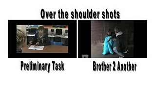
As you can see above, both Over the Shoulder Shots are quite different, one from a level angle (basic) and the other slightly more creative and thought up to prove effective when representing social class.
The 180 degree rule is also an important rule you must consider when filming, if you film from the other side of this are the audience will be off put and likely to be dis-orientated. We had to be very careful when filming a conversation in both films as it is easy to step over this line without realising, resulting in a messy confusing scene, likely to put the viewer off.
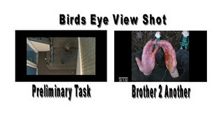
In the screen grabs above you are able to see the difference and progress we have generally made on the creativity and thoughts behind the shots, using the birds eye view shot or in 'Brother 2 Another' a point of view shot, these both work in similar ways, a birds eye view shot helps the audience to get a general over view on what/where the character is doing/going, in this case going up the stairs. Whereas in 'Brother 2 Another' the point of view shot was used to allow the audience almost see the world through the characters eyes, in this case, experiencing, pain, shock and fright from the mugging, also helping the audience to feel involved in the story.
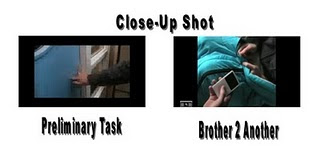
Close-ups are one of the standard shots used regularly with medium shots and long shots. Close-ups display the most detail, but they do not include the broader scene.
Close-ups are used in many ways, for many reasons. Close-ups are often used as cutaways from a more distant shot to show detail, such as characters' emotions, or some intricate activity with their hands. In this case an in depth sense of shock is made by the shot to highlight the issue of a brutal attack.
Evaluation - Activity 6
We used many different tools and technologies and other media products/kit to help construct our final media product.
We used:
School/Home computers - To edit and upload/update new features onto our blogs.
School supplied camera and tape - We used these film and record our opening two minutes aswell as filming audience feedback and directors commentary.
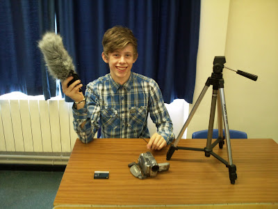
Microphone - Extension microphone used for our opening two minutes allowing us to get a good quality of sound from the character outdoors.
Tripod - We relied on the tripod for many steady shots to enhance a better quality of filming.Car - To travel to each different location safely and comftably. (It was freezing)
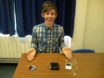
Ipod - This was used as a prop in our scene of William being mugged, to help illustrate wealth.Wallet & Keys - This was used as a prop in our shot of expressing the materialistic goods in Williams house as he goes to pick up both items. (match on action)
Phone - This prop was used when William is first introduced showing the audience the contrast on how William has up to date technology at his finger tips.
Fruity Loops 8 Home Studio - This was used at home to construct a suitable soundtrack for our opening sequence.
Adobe - We used Adobe Premiere 8 to edit and construct our opening two minutes aswell as using Adobe photoshop to help put together our screen grabs and complete presentation.
Memory Stick - Using memory sticks as a back up was a good idea incase of any computer errors we all had a copy of our progress, fortunately we didn't have any computing saving errors. This was also useful from travelling information from home to school.
Blogger - We used blogspot blogging to present our research, planning, evaluation and final media product.
Youtube - Finally one of the most useful websites, youtube - we found that it was very helpful when constructing our research and if we needed to see how other openings were presented in a paticular fashion. It was also used for research and easy viewable videos to then evaluate for our research and planning, helping us finalise our genre and target audience.Below are some pictures of me and some equipment we used:
Evaluation - Activity 5
Evaluatioin - Activity 4
I believe the typical audience member for our media product would be anyone in between the age of 15-24 who likes getting involved with deep story lines which relate to an urban reality of a the diversity between lifestyles of teenagers.
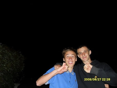
This is Jack and Louis, Louis is 17, Jack a little younger at 16. They both share many of the same interests including graffiti style art, bmxing and gaming consoles. They are most likely to shop at outlets such as 'topman' and' 'JD Sports'. Or occasionally at more unique outlet stores such as 'size' or 'Mash Clothing' whom support the youth of today keeping up with what's new and fresh on the street. They are most likely to be found listening to the new form of drum and bass - dubstep, distinguished by it's two-step rhythm, fast beats and kicks, which are exactly what they live for. Their favourite sort of TV programmes include music channels such as MTV and TMF however also likely to watch relating teenage series such as 'The Inbetweeners' and 'Skins'. From this i am able to gain a tourough understanding of their likes and dislikes. Therefore then able to using this to my advantage to help our film stand out to them both. As they share a keen interest in music alongside many aother tenagers of the same age we could involve their social groups genre of music within the film, as did 'Adulthood' using cool and up to date urban music, to help relate elements of the films to thier lifestyles themselves. Using Pathe institution when distributing their film they; used music as it has a huge influence on the target urban 16-24 year old audience. Their strategy was then to leverage this passion for music and tap in to the viral nature of social media to build credibility for the film, and generate early hype among a new 16-24 audience.The film had to feel niche, real and about them so the challenge was to talk to them on their level by infiltrating their worlds to give the film credibility.
Evaluation Activity 3
Tuesday, 30 March 2010
Evaluation - Activity 2

Above is a screengrab of Jack's friend (deprived), as we have only three main characters who all play a major part in the opening i decided to pick Jack's friend, to help illustrate and represent the deprivation of certain characters and their social groups within urban, drama films, for an example i have screen grabbed an image of actor Adam Deacon playing Jay in Adulthood.

Both characters represent the lower class citizen - stereotypically known for involving theft, violence and drug abuse into their day to day lifestyles, helping them to get by and cope with the struggle and strife they go through.
Both Jay and Jack's friend have a similar dress code of jeans and hoody a typical teenage 'yobby' look about them, with a lack of self respect likewise representing themselves as 'whatever guy'. The style in which they are dressed is easily recognised by the audience helping them apply specific information into how they should generalise the character. Also easily recognisable is body language, most audience members will pick up on body language sub-consiously being able to identify or judge characters accordingly. In this case - Jay has a slouched body posture, with arms swung wide, as though to appear bigger than normal, head held high with a facial expression, appearing cocky and confident to over-compensate for his size. Whereas Jack's friend has a similar attitude with broadened shoulders to over-compensate for his size, with his hood up covering him from being identified and related to a crime scene.

Evaluation Activiy 1

These are ten screen grabs from our completed two minute opening sequence. I have chosen to evaluate and write about how they are typical or not of opening sequences of the same genre.
Frame 1 - Font and Style: BBW is the name of our production team. I believe this screen shot identifies the title font and styling in which we decided to use to help illustrate the style film, incorporating a bold basic font, commonly used in drama films. Then the added glowing shaded effect around the words we felt emphasised the unaccompanied production company, highlighted with the black background to be clear. We went for a simple but effective use of title styling to stand out to the audience.
Frame 2 -
Frame 3 - Setting/Location: Our screenshot is of 'Williams house' to help illustrate the wealth of his lifestyle this long shot of the house establishes the parallel editing of two very different, diverse lifestyles allowing the audience to identify with the setting. Establishing shots are very popular when setting scenes and locations especially in drama genres helping the audience to identify with the story.
Frame 4- How characters are introduced: I have chosen the screen grab of Jack in the shop, putting a chocolate in his pocket; I believe this best identifies his introduction into a deprived lifestyle, illustrating theft as a way to get by. Immediately identifying one lifestyle, therefore soon to come will be an introduction of a different lifestyle, able to help the audience contrast and compare the differences applying positives and negatives and the obstacles in which the long lost brothers have to deal with, crossing the paths of one and other, dealing with life in their different ways. An introduction of parallel editing is often used in urban, drama films to clearly identify the differences between up to several characters.
Frame 5 - Camera Work and Editing: This shot is of William dipping his shoulder as to enter the room; the editing of this was carefully done, to enhance the 'match on action' as William's shoulder dips into the room immediately as it is picked up. When doing this we had to mark out how big the steps taken were going to be and which foot and shoulder (left or right) would enter first. By constructing a smooth match on action, by this adds to the professional finish of the film. In this shot we used the tripod to enhance the stability as well as using hand shots held due to the awkward positioning. The mise en scene I think speaks for itself with the majestic and luxurious interior design, representing Williams surrounding ands privileged upbringing effectively.
Frame 6 -
Frame 7- Genre and how the opening suggests it: The screenshot which I chose best identifies a contrast in lifestyles as this is the second two-shot of both characters. I believe this helps illustrate an urban, drama style film, relating to reality and the ups and downs of life it self. Mise en scene also helps suggest the genre by using costume i.e. The wealthy boy dressed in smart/casual clothing, Deprived boy - Scruffy hooded jumper and jeans. Both with very different body language, a polite, well postured walk from the wealthy boy, suggesting his wealth and upper class lifestyle, whereas the body language given off from the deprived brother is almost opposite; bad postured walk, head down, hood up, rough expression. By incorporating a prop (the ipod) this helps to give the audience an even clearer understanding of who's who. As an ipod is not a necessity but a luxury only the wealthy character would have one, suggesting a life of luxury.
Frame 8 - Story and how the opening sets it up: This screen grab in which I chose; I believe represents the story and how the opening sets up best contrasting two types of characters, one deprived and one wealthy, unfortunately there is no scene in the opening two minutes in which both brothers meet, although I think this is the shot that best illustrates the story - The deprived boy steals the wealthy boys ipod this outlines the main story, of the contrasts of lives, almost as though the deprived boy steals off the rich boy to stay alive, by buying food and drink, at which point the wealthy boy doesn't realise how he is supporting his long lost brothers' life starting to link the brothers in the opening two minutes. Now leading on with the rest of the film, to show both brothers growing up in completely diverse lifestyles and how they come across each others paths positively and negatively.
Frame 9- Special Effects: The screen grab I chose which I believe best shows our effects is after the wealthy boy (William) gets mugged for his ipod, left against a fence shook up and bloody, the blood we used was fake fortunately as I didn't fancy getting beaten up, whilst playing the character. As a low budget film, very little 'special effects' were used; consequently I found it hard to find a suitable screen grab. The effect of blood is commonly used in films, to illustrate empathy or shock to the audience, suitably as the average audience member may be drawn into the attachment of characters and fight scenes suggesting social hierarchy of the characters commonly used in urban, drama films.
Frame 10 - The title of the film: Our title of the film is set on a black screen, like the majority of urban films I have evaluated, I believe starting on a black screen allows the audience to be drawn in and want to see how the film starts without giving it away to early, I believe this technique builds tension towards the actual film and allows the audience to focus on the title of the film, in our case helping them to understand the storyline, without giving away anything interesting persuading them to keep on watching. The red styling of the '2' gives the sense of blood, fright and danger between both brothers.
To conclude I believe our opening two minutes, media product, I believe we have used many tools and techniques to help support and clearly suggest the urban, drama genre.
Tuesday, 23 March 2010
Completed 2 Minute Opening Sequence
Brother 2 Another This is our opening two minutes of a film, we have to do as part of our coursework for AS Media Studies. Our opening two minutes shows two brothers who are completely un-aware of their relation, as they were separated when young, currently living very diverse lifestyles. Filmed, Edited, Directed and Produced by Max Whicher, Dave Bouchard and Tom Boswell
(Fri 19 Mar 2010 09:35:20 Views: 91 Rating: Comments: 2 Text Comments amylewissimon1 - Very good, I like the story and how you have shown the contrast between the two characters :) mattyd101 - UserDecent boys... I like it!
Wednesday, 17 March 2010
Research and Planning - Final Script
Jack: Where dya get this?
Jack's friend: Yeah i nicked it from posh kid init.
Jack: C'mon let's go now and sell it.
Jack's friend: Standard
We understand this is short and sweet, however it was short and sweet as we believed 'less was more if you like' keeping the dialogue to a minimum a meant we could were more able to keep a reasonably fast tempo beginning, in aim of getting the viewer more engrossed into what is going on
Research and Planning - Music Sound Track Process

Research and Planning - Official Sound Track
Tuesday, 16 March 2010
Research and Planning - Music Inspiration 3
Finally this is my favourite possible soundtrack so far, i believe it to be ideal for what we are after. it builds tension smoothly, however helps in introducing the charcters at the same time.
Research and Planning - Music Inspiration 2
This seems as though it could be an ideal soundtrack for the morose atmosphere we are trying to create in our opening two minutes. I believe the sound track accompanied by the piano effectively helps illistrate the lifestyle of the wealthy brother whilst the drum beats represent the lifestyle of the deprived brother.
Research and Planning - Music Inspiration 1
I feel this is a perfect tempo to the relevnce of what is going on in our opening sequence. It builds tension nicely whilst mentaining fairly dark and griity feeling to film. I also think this could then drop into another beat, with a faster pace keeping the audience on edge.
Research and Planning - Filming
Our first obstacle was having to dodge filming around cars that were parked temporarily as we needed to film every scence a number of different times from different angles so we could use fast, sharp editing. Therefore if we were filming the same secene over the course of 20 minutes, cars may have moved. We overcame this by filming when there were as little cars and other external factors as possible.
In our storyline the deprived brother steals a chocolate from a newsagent Our second obstacle was having to disscuss with the shop owner if this would be allowed for the good of our AS media work. Wwe weren't necessarily sure if we'd have permission to film in her shop, although after a bit of persuasion she let us go ahead whilst there were no customers.
Three teenage boys, let loose for a day, it was inevitable we'd make a mistake at some point. An unfortunate recording error whilst filming in the newsagent was our third problem. The footage we thought we had filmed whilst in the shop hadn't actualyy recorded. We had only realised this 15 minutes once we were at our next location. Luckily not too far away, after the embaressment we came back to the shop to re-film, luckily everything ran smoothly second time round.
These three obstacles awere fortunately quite small were are only real dilemas throughout the day, however i think we coped well and thought logically, allowing us to move on and carry on filming consitently throughout the day.
Friday, 5 March 2010
Research and Planning - Evaluation - Changes made from our original plan
Thursday, 25 February 2010
Research and Planning - Current Progress
---
As a group we are currently making steady progress, our editing of our two minute opening is near completion. We attempted to stick to our original story board as much as possible, and resemble our film story line as much as possible too. However as we had to cut some shots out to have the corrected time length required some elements were not possible to fill in therefore are finished product doesn't quite match our original plan. Soon I will begin my personal evaluation of the work I have done. This should enable me to have completed everything that needs to be done and save myself enough time to read over everything and make alterations where necessary.
Monday, 22 February 2010
Research and Planning - Audience Profiling
Tuesday, 9 February 2010
Research and Planning - Time Managment
Monday, 25 January 2010
Research and Planning - Time Managment
Wednesday, 20 January 2010
Research and Planning - Props
This is the iPod which belongs to William, shown to represent his wealth. It is stolen from him when walking through the park by a stranger (the other deprived child), the theif then takes it back to Jack to sell it or show it off, we havent discussed that yet.
Saturday, 16 January 2010
Research and Planning - Character Profiling - Dave

Research and Planning - Character Profile - Tom
Research and Planning - Character Profile
Friday, 15 January 2010
Research and Planning - Two minute opening sequence
Now the introduction of the other male character (William). He is introduced with an establishing shot of a larger than average, modern house. Diagetic sound of shouting/arguing can be heard coming from the house. A mid shot of the character then leaving the house through the front door. He slams it shut (emphasised diagetic sound of door slamming). He then runs up the road, a long shot is used to view the scene. The camera movement tracks him as he is running, having a mix of close ups on his face and shots of his feet to emphasise his frustration and feelings. The camera follows him for about 20-30 seconds, until he stops exhausted, he bends over to catch his breath a long shot is used from the camera. He then lifts his head up as he hears the voice of his step father behind him, a close up is now used. He begins to run again, he reaches the park. and hides in the bushes. a long shot is used filming him looking around worryingly for his step-dad. He then walks out the bushes, and walks down the pathway.
Another character is now introduced with a long shot. He is sitting on a bench in the park, where he is having a cigarette, looking quite happy with himself. A close up of his face is then shown, as he looks to his left to see William walking towards him. A point of view shot is now used from the new characters angle. William is minding his own business, with his ipod headphones in (music will be played as if William is listening to it, when cutting back to the new character the music volume will go down, to give a bit of realism). He then pulls out his ipod to change the song. A mid shot is now used. The shot then changes to a close up of the new characters face, showing jealousy. A close up of the ipod. A two shot of the two characters. One in front walking towards the camera, then the other guy jumping up off the bench, running at the other character. A mid shot of him snactching the ipod, the punching him. William then falls backwards. The other character runs off, a long shot is used and the camera stays stationary as the character gets further and further away. Camera then cuts back to William curled up on the floor in pain, cutting back to the other character running away then back to William on the floor. Music will then kick in again and the film name will appear on screen. End of two minutes.
Monday, 11 January 2010
Research and Planning - Story board and Shot Types
 Name of production company on top of black screen. No digetic music. Middle of the screen, title sequence shot.
 As BBW slowly fades out, UK Film Council slowly blends in still on top of black screen, non-digetic music then slowly begins.
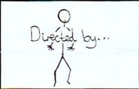 Mid-shot, clip fades in at a medium pace, music still playing to keep in background to keep continuity, however some digetic sound being heard for realism and to set the scene - mid shot of boy walking.
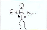 Same shot and sound, however as the name of director is faded out, the edited by will be faded in at a medium pace in order help maintain a steady pace so that it easy to watch without getting to boring.
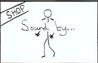 Again fast/medium cut between shots, same sound - continuity, this time he's got slightly closer to the camera - in between mid shot and close up.
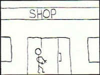 Fast/medium cut to an establishing shot of the boy arriving and walking into a shop. The same digetic and non-digetic sound played to help continuity however all non-digetic sound begins to fade out towards the end of of shot. Establishing shot.
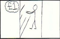 Cuts to mid-shot of boy side on facing towards shelves. All non-digetc music quickly continues to fade completely out. Only digetic sound herd, very slowly begins to zoom in towards end of shot - however only a little.
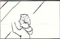 The next shot is a close up of the top half of the boys body showing precise movements of him picking up food off the self. Still only digetic sound heard.
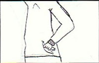 Another close up this time showing the mid-part of his body putting the food into his pocket, creating the impression he is going to steal it.
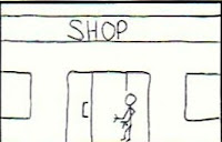 Similar to previous shot of establishing shot, this time showing the boy quickly walking out. Mid-shot, camera fixed in one position, shot not lasting any more then five sections. To keep up the quick intensive pace or footage to make it easy to watch.
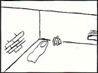 It then cuts to another establishing shot, of where the boy is living, shown through a high angle, representing his deprived lifestyle. Portraying his habitat in a negative light.
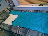
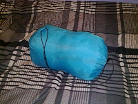
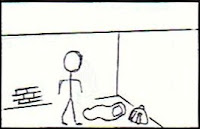 Then it will cut to a close up/ mid-shot of him standing next his belongings and sleeping bag, very slightly zooming in. Eye level (more of personal level) used to creative sympathy for the character. The glum surroundings are used create a poor deprived atmosphere (use of mise en scene).
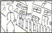 Then creating a contrast in characters, a low angle shot is used to show a wealthy looking boy (this is the other brother). Use for mise en scene, we are going to film him walking down a road listening to an ipod, with large expensive house's in the background. Mid-shot, low angle, long shot of house's in the background.
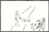 Then cuts to a shot of the 'rich' boy walking past an obvious poor boy sitting on a bench, 'William the wealthy boy, gives him a clear smug look and throws the remains of the sandwhich he's eating in the boys direction towards his feet. This will be shown through about 3 different the first one being a two shot, then cutting to a close up of William face clearly showing his expression towards the other boy.
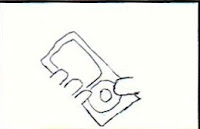 To then emphasise on the boys wealth, there will be a close up of the ipod, also representing on the difference in wealth between him and the poorer boy. This will only need a quick close up.
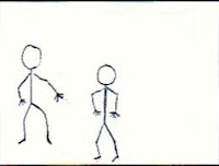 It will then cut to a mid-shot of the 'William' walking along from in front of him, showing the poor boy in the background get up and beginning to follow him.
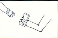 It will then follow into a different two shot from a slightly closer angle. The poor boys intentions are now made clear as he attempts to make a grab for the ipod and push the 'William' to the ground.
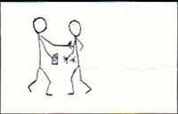 Quickly cuts to a side on view to clearly show the two boy's tasseling, mid-shot/ two shot, sound emphasing more on fight, no non-digetic sound.
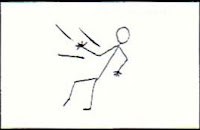 Continuing in to close up/ mid-shot of the rich boy falling after being pushed, non-digetic music slowly begins again.
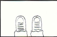 Extreme close up of feet (birds eye view/point of view), still shot lasting for 4 seconds lack of movement makes the shop seem slow. Slowing down to create depth of in the story and create emotion.
 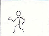 Then alternatively cutting to a quick shot of the poor boy running away, creating a difference in emotionall state of the two boys.
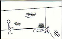 Then cutting time, goes to shot of the poorer boy coming back to the place where the original shop thiefs is living (the wealthy's brother). Two shot showing a connection between the two people, they are equal however a high shot representing that they are both poor and dont that they are looked down on in society. Although they're commiting crimes, it's portrayed in a manner that makes you sympathize with them.
Wednesday, 6 January 2010
Research and Planning - Time Managment
-anamatic
-
Tuesday, 5 January 2010
Research and Planning - Rating

Drugs - Drug taking may be shown but the film as a whole must not promote or encourage drug misuse. The misuse of easily accessible and highly dangerous substances (for example, aerosols or solvents) is unlikely to be acceptable.
Horror - Strong threat and menace are permitted unless sadistic or sexualised.
Imitable behaviour - Dangerous behaviour (for example, hanging, suicide and self-harming) should not dwell on detail which could be copied. Easily accessible weapons should not be glamorised.
Language - There may be frequent use of strong language (for example, ‘fuck’). The strongest terms (for example, ‘cunt’) may be acceptable if justified by the context. Aggressive or repeated
use of the strongest language is unlikely to be acceptable.
Nudity - Nudity may be allowed in a sexual context but without strong detail. There are no constraints on nudity in a non-sexual or educational context.
Sex - Sexual activity may be portrayed without strong detail. There may be strong verbal references to sexual behaviour, but the strongest references are unlikely to be acceptable
unless justified by context. Works whose primary purpose is sexual arousal or stimulation are unlikely to be acceptable.
Violence - Violence may be strong but should not dwell on the infliction of pain or injury. The strongest gory images are unlikely to be acceptable. Strong sadistic or sexualised violence is also
unlikely to be acceptable. There may be detailed verbal references to sexual violence
but any portrayal of sexual violence must be discreet and have a strong contextual justification.
Sunday, 3 January 2010
Research and Planning - More costume ideas
Saturday, 2 January 2010
Research and Planning - Costume Ideas
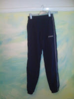
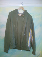
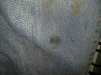
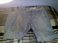
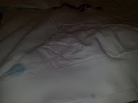
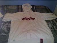
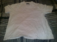
In our opening two minutes we must portray the deprived boy as an ungroomed, scruffy character. We have narrowed down our ideas for the characters outfits, thinking about all the possibilities of generalisations as though to have a stereotypical view on the character to be easily identified by the audience.
We have decided upon this hoodie to be worn by the deprived brother as it is scruffy with marks of paint on it, we also decided on a specifically plain t-shirt as this will be covered by the hoody. The tracksuit bottoms which are also stereotyped to be worn by a specific casual tatty person;
